
Back to Portfolio
our work
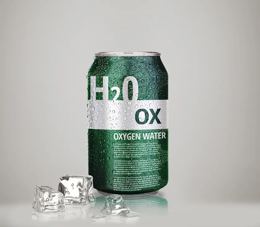
XO Packaging design
XO Water is introduced as a product defined by precision and intention, where carefully balanced mineral elements and a specific pH level shape both its quality and identity. The packaging reflects this refined composition, translating the science of the product into a clear and confident visual language that communicates purity, control and trust.
LimeConcept developed the packaging system so every detail positions XO Water as a distinctive presence in the market. From material choices to layout and typography, the design emphasises quality that invites attention rather than demands it.
Developer commentary
The packaging system had to carry mineral composition and pH without turning the bottle into a data sheet. Typography and material choices do that work.