
Back to Portfolio
our work
Calibri.lv — Finding the clear route through a website
Public site: calibri.lv
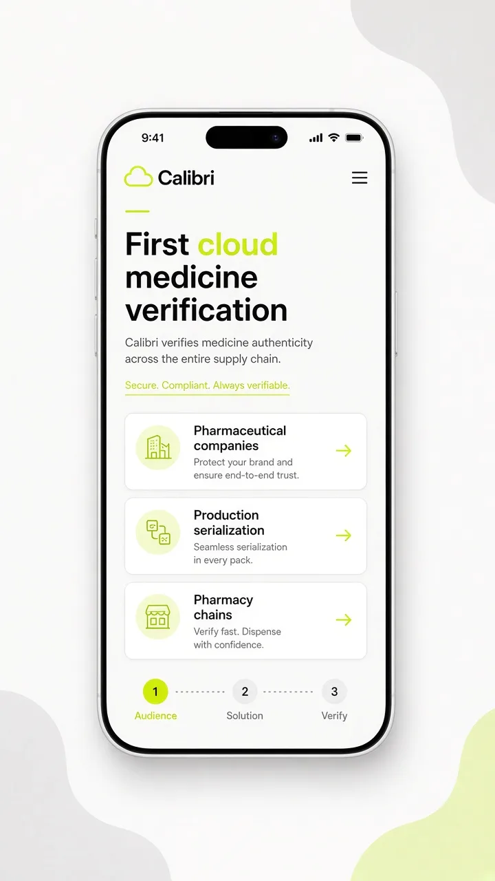
A visitor’s first few seconds tell us a great deal about a website. They need to understand what the organisation offers and where to go next, especially on a phone. The Calibri case shows how the page structure answers those questions.

Functionality
The public site describes Calibri as a cloud medicine verification and serialization product: multi-user accounts, six scanning modes, statistics with timestamps, encrypted storage, 2FA and browser use without installation. Contact details on the site match LimeConcept’s Riga office. LimeConcept’s exact implementation scope still needs archive confirmation.
From concept to implementation
- Review content
- Map key pages
- Design the main journey
- Test desktop and mobile
- Implement
Developer commentary
The detail that makes the first seconds easier is the homepage stack: product name, “first cloud” claim, then who it is for (pharmaceutical companies, production/serialization, pharmacy chains). Interior frames show a representative content block from the live site and a labelled mobile journey concept where a live narrow-viewport capture is used or supplemented.